The Indian Institute of Management-Ahmedabad (IIM-A), possibly India's most prestigious management school, is in the middle of a logo row and made headlines for all the wrong reasons last week. The institute is considering changing its existing logo with two new designs, one for international audiences and another for domestic, but according to reports, the plan was put into place without consulting all the faculty members and is the main reason for the discomfort according to a letter signed by 45 professors of IIMA two days ago.
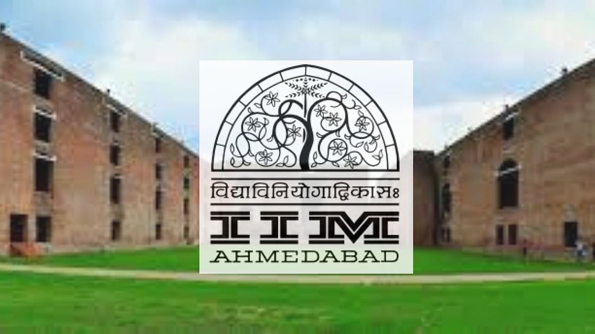
The present logo of IIM-A — adopted in 1961 when the institute was established — and has the motif of ‘Tree of life’, inspired by an exquisitely carved stone latticework jaali or grille of Sidi Saiyyed Mosque in Ahmedabad that was built in 1573 AD. It also has the Sanskrit verse, 'Vidya Viniyogadvikasa' (development through the distribution or application of knowledge).

The motif design is widely used in many Gujarat government tourism advertisements and brochures. Published reports further discuss that the mosque’s grille is present in both new logos but less prominently, and the Sanskrit shloka is there only in the international logo. The idea of getting a visual identity was initiated by IIM-A’s founder members, Vikram Sarabhai and Kamla Chowdhry, after the foundation of the B-school in 1961.
“The logo is our identity — the jaali and the Sanskrit verse define us and our Indian ethos. For us, it is a symbol of our Indianness, our connection with “vidya”, our link to the Institute. It is our commitment to “Vikas” of the country, industry, society, students, and management discipline. It is our philosophy and mission statement. Any change in the same, either in artistic rendition or change in verse, is an assault on our identity. The change of logo will have far-reaching implications and long-term consequences on the institute’s brand and its stakeholders,” the letter read, asking the board to inform them about the “process followed to arrive” at this decision.

Meanwhile, this issue is only providing fodder to netizens, many of whom are twisting it for their personal and ideological gains. It is sadly getting to be a senseless political issue with some moving away from the core issue of the redesign.
IIM Ahmedabad, in an official statement over the logo change stated: “The Institute, in the process of revamping its website, found the need to refresh the logo. Evaluation, exploration, development of wordmark, development of brandmark were all kept in mind while coming up with the final design recommendations. The proposed logo continues the legacy of the original logo, retains the status line in Sanskrit (VidyaViniyogadVikasa) as in the original, the colour rendition has been improved, the fonts modernized, the 'jaali' inspired brand mark has been made more amenable to communication in digital media, and the brand name made more distinct. The proposed logo is to be released in June of this year after the annual vacation.”