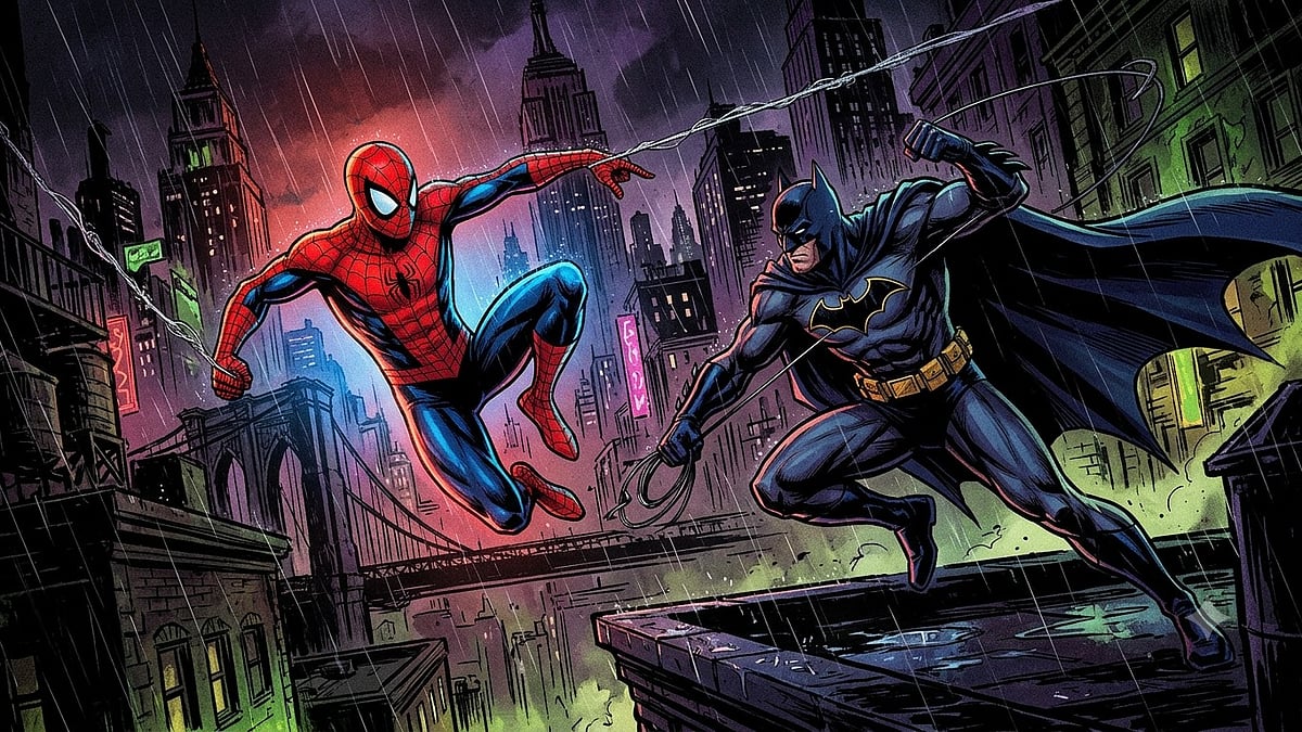
With Spider-Man: Brand New Day swinging into theatres and the web series Batman: The Caped Crusader returning for its noir-drenched second season, both are reminders that colour still does the storytelling audiences never notice, before a single line of dialogue is read.
Before comic books became a billion-dollar franchise and digital spectacles, they relied on something far simpler to capture attention: colours. Long before readers learned a character’s backstory or motivations, colour already told them whom to trust, fear, or admire.
Bright reds and blues often symbolised courage and heroism, while darker greens, purple and muted shades hinted at danger, instability, or corruption. In the early decades of comic books, colour was not just decoration, it was necessity disguised as genius.
Accident of limitation
Comic books emerged in the 1930s during the era of constraining printing technology. Publishers relied on the CMYK process: cyan, magenta, yellow and black (krypton) dots layered onto cheap, porous paper. The results were unpredictable. Subtle gradients became muddy smears. Complex colours blurred together on the paper. Colours that look vibrant on the artist’s board often arrived on bookshops as murky approximations.
This forced a radical simplification. Artists abandoned nuance. Primary colours became essential because they reproduced clearly despite of poor printing quality. Red, blue and yellow stayed the same. Meanwhile, complex colours, shadows and tonal shifts were abandoned as liabilities. What emerged from this constraint was accidental brilliance. A visual language so direct and emotionally immediate that it shaped popular culture for generations. Heroes didn’t just wear bright colours, they wore their colours. The costume was the character.
Psychology of colours
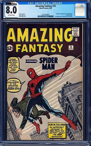
Spider-Man Comic |
Red symbolised action, urgency, and courage. Blue conveyed trustworthiness and stability. Yellow radiating hope and optimism. These weren’t subtle or debatable. They communicated directly to the nervous system, bypassing rational thought. Captain America’s patriotic colours reinforced ideals of justice. Superman’s red cape and blue suit became the definition of nobility. Batman, though darker than his peers, balanced black with decisive pops of blue and yellow to remain legible and iconic.
This created a shorthand that worked perfectly for young reader consuming comic at speed. You didn’t even need to know Clark Kent’s character arc to sense Superman’s reliability because the colours told you everything you needed to know before the story even began.
Spider-Man case study
Few characters demonstrate this principle better than Spider-Man. When Stan Lee and Steve Ditko introduced him in 1962, they made a simple choice: red and blue. The decision accomplished multiple objectives at once.
Red captured Peter Parker’s restless energy and emotional intensity while blue grounded him with sincerity and accessibility. Together, they made Spider-Man feel both dynamic and approachable hero for teens, not gods. But there was another function, the costume needed to pop out against urban grey of New York City. When Spider-Man swung between building or twisted through panels, readers tracked his movement instantly. The colours were practical camouflage against the page itself.
As designer and illustrator Arunava Das notes, “Spider-Man’s red-and-blue costume creates strong visual contrast against green-themed villains like Green Goblin. This makes action scenes more dynamic and keeps Spider-Man visually dominant on the page.”
The contrast wasn’t accidental, it was visual strategy covered up as costume design.
Villain’s palette
Spider-Man’s rogues gallery tells an equally revealing story. The Green Goblin, Doctor Octopus, and the Lizard all incorporated green into their designs. This wasn’t random. While green can symbolise growth in nature, darker greens carry psychological weight: poison, mutation, instability, corruption. In Spider-Man comics, green became the colour of colour of chaos.
Comic book enthusiast Zayn Fernandes captures this paradox perfectly, “Colours always shape a person's perception as colours have emotion. Although green is a positive colour, the reality is that making any colour dark shaded brings a little evil aspect to it.” This insight explains why Spider-Man’s villains don’t wear vibrant, hopeful green colour, they wear corrupted, darkened versions that subvert the colour’s natural associations.
The contrast was chromatic and psychological. Red and green sit opposite to each other on the colour wheel, creating visual tension. When Spider-Man battled the Green Goblin, their fights became visual opposites before they become physical ones. Spider-Man represented responsibility and hope while Green Goblin embodied madness and destruction. The colour wheel delivered this message silently but unmistakably. Comic artists understood colour theory intuitively. They weren’t just painting costumes, they were composing conflict itself.
Rules and Exceptions
Across comics, a pattern crystallised. Heroes wore bright, clean colours while villains occupied darker or unsettling shades. This visual grammar became so ingrained that audiences instinctively read colours as moral indicators. Dark equalled dangerous while bright meant good.
Yet this rule had always been more fluid than it appeared. Some heroes operated in shadow like Batman, being the most obvious example while some villains had shocking colours. The pattern was strong enough to shape expectations, but not so rigid that it eliminated surprise.
Digital legacy
Modern comics have abandoned many of these constraints. Digital colouring permits infinite gradients, cinematic lighting, and ambiguous palettes. Contemporary storytelling allows for morally complex characters in complex colours.

Illustrator and designer Kapil Gholap observes this shift: “Today, the approach has evolved significantly into complex, mood-based palettes... Today, artists use realistic and mixed colors because modern characters are not just purely good or bad.”
This reflects a fundamental change in how we tell stories. Where Golden Age comics dealt in absolutes, contemporary narratives embrace grey areas and colours that follow suit. Yet the foundation remains the same. Those decisions made in printing rooms became embedded in how audiences process visual storytelling. What began as a technological limitation evolved into a universal language.
In the end, comic book colours were never merely decorative. They were tools of instant psychology, a way to communicate character and intention before the first word was read. Long before you knew who the hero was, the colours had already decided for you.