Charcha time: Does The World Map Need Decolonising?
From Mercator to Equal Earth, a debate over how map projections shape our understanding of size, power and geography

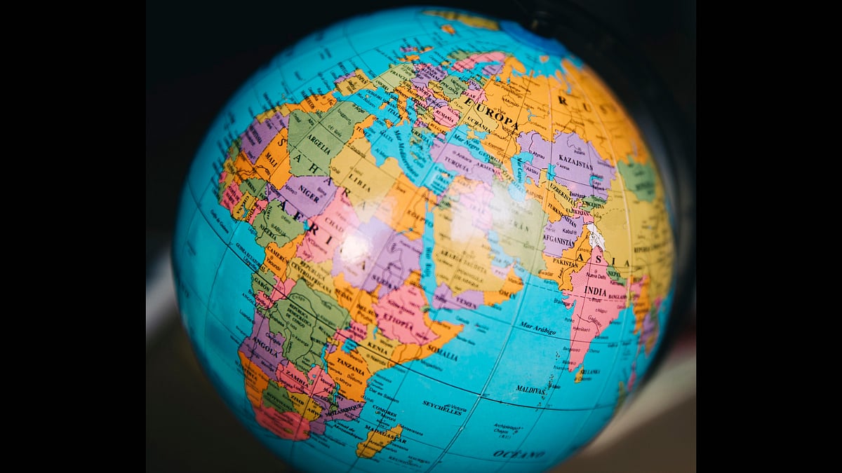
For centuries, the Mercator map shaped global perception, inflating former colonial powers while shrinking Africa, Asia and Latin America, a distortion critics tie to the lingering colonial-era hierarchies. As geopolitical awareness grows online, debate now questions whether classrooms should adopt fairer alternatives like the Equal Earth projection. Satya Tirtharaj Ghosal moderates a debate.
Aparna Phadke, Associate Professor, Department of Geography University of Mumbai
Mercator, developed in the 16th century, remains useful for navigation since it preserves angles and shapes, but distorts polar landmasses severely unlike equal-area projections, which preserve real relative size.
This distortion had real geopolitical consequences. Mackinder's 1904 Heartland thesis relied on Mercator, inflating Eurasia's "pivot" region far beyond its true size fitting, given this was the height of colonial competition for resources. Presenting the thesis to the British Parliament, he urged that geography be taught so children would "continue the legacy of children of imperial race." Europe was framed as gateway to this exaggerated heartland, a view that shaped German Geopolitik as Haushofer adapted Mackinder to bolster Germany's post-WWI ambitions. Spykman countered with a maritime-power thesis, emphasizing the possibilities of rimland connectivity. These Mercator-based maps materially shaped geostrategy and war through the early 20th century. Tellingly, when Harrison and Weigert later redrew Mackinder's map using an azimuthal equidistant projection centered on the pivot, it exposed just how much Mercator had exaggerated the heartland's size.
Geography teaching in Indian schools remains pathetic. Training in how projections are constructed and where their distortions fall is missing. CBSE once had stronger cartography grounding, now diluted; state boards fare worse. Textbooks recycle maps from outside agencies; one 11th/12th standard geography text notoriously used CIA-prepared world maps.
Little effort has gone toward projections representing the Global South's true scale. Correct projection uses matters, but decolonizing geography alone isn't enough, it needs fresh discourse through orientalism, subaltern studies, and neglected historical geography.
Gaurav Nandagawli, 5th Undergrad Student in Chemical Engineering
Growing up, the Mercator map was just "the map", on library walls, in atlases, in every textbook. Europe and North America looked massive and central whereas Africa, South America, and Southeast Asia looked smaller and pushed to the edges. I never consciously thought "bigger means more important," but looking back, it likely reinforced a quiet hierarchy where visual space is being translated into a sense of historical or political importance that had nothing to do with reality.
I only learned the truth from a YouTube short, not from school which says a lot. Seeing Africa's real size (large enough to fit the US, China, India, and most of Europe) genuinely broke my brain. Now I can't unsee it, I mentally footnote "this is inflated" every time I see a standard map, especially near the poles.
Mercator's World Map doesn't need to disappear, it's still useful for navigation. But for teaching kids geography and relative scale, an equal-area projection like Equal Earth is a more honest starting point. We're a visual generation absorbing the world through images and maps more than text, so a skewed visual creates a skewed takeaway, even subconsciously. Notably, Google Maps still defaults to a Mercator-style view with same distortion and sleeker packaging.
Maps aren't neutral, they're a visual argument about what deserves attention. Consistently shrinking a region can make it feel less relevant or central, with zero basis in reality.
So, is switching projections a fix or a distraction? Honestly, somewhere in between since it isn't a cure for global inequality, but a meaningful signal that ripples into how geography and history get taught. A small but real correction.
Srijani Chaudhuri, Master Student In Journalism & Mass Communication
As a child, I believed that the countries appearing largest on the map such as Russia, the USA, and Canada were the most important or powerful, simply because of their size. I never questioned whether this was a distortion of reality, which later made me realize how much we can be shaped by something without even noticing it.
I had heard of the Mercator projection before, but never realized how significantly it misrepresents size. Learning about this distortion changed how I see world maps entirely. A map is just a representation, not a perfect mirror of reality. It's also made me want to explore other projections and their purposes.
I think schools should introduce projections like Equal Earth alongside the traditional Mercator, since it would help students grasp relative scale more accurately. Mercator still holds historical value and can be taught for that reason, but exposure to multiple projections would give students a more balanced view of geography.
Visual representation carries enormous weight today, especially as youth consume information through digital media at high speed. When a region appears larger than it is, it can distort perceptions of its population, influence and relevance, making visual literacy more important than ever.
This raises a real question, do maps shape how young people perceive different countries' power or culture? I believe understanding projections can help dismantle stereotypes by revealing that a country's visual "size" can be manipulated, not factual.
Ultimately, I think changing the map is worthwhile. It won't reshape global power dynamics, but shifting how students visually understand the world is a small, and a little change is always good for the mind.
Zayn Fernandes, Advertising Professional
Comparing traditional maps with digital navigation often reveals striking inaccuracies, countries that look small on a regular map frequently cover far more area than we assume. This makes a strong case for taking active steps toward better geographic understanding. If the world can't be explored through travel, it should at least be explored through maps and geographical study. This isn't just academics, geography plays a real role in trade between countries to avoid losses tied to resource and material planning.
Adopting a more accurate projection could help give people a more proportionate visual sense of how countries and continents relate in size. That said, changing the projection alone wouldn't necessarily reshape how people understand history or global power. The distortion is visual, not the root cause of those perceptions.
Geographic study itself wasn't nearly as advanced in the past as it is now. Digitalization has allowed us to explore the world in far greater depth, including tracking complex changes like shifting atmospheric patterns across regions.
Projection choice matters, particularly because the Mercator projection significantly distorts size the further a region sits from the equator. Its historical usefulness for navigation is a separate issue from whether it's the right tool for teaching relative geographic scale.
Ultimately, this is mostly about geographical accuracy, with a touch of historical storytelling woven in. Since the world itself keeps changing, with new nations, shifting water bodies, forming mountains, and glaciers that continue to grow and melt.
RECENT STORIES
-
-
-
-
-